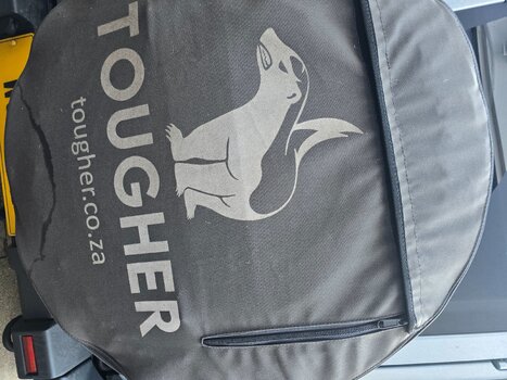
I hate the tougher logo. It’s like some generic modern looking design, unlike the plethora of automotive aftermarket company branding.
MM logo evokes old Safari/Brooks vibe. Contributes to the grenadier’s obscure energy.
For something so prominently visible (interior and exterior) aesthetics & projection matter
MM logo evokes old Safari/Brooks vibe. Contributes to the grenadier’s obscure energy.
For something so prominently visible (interior and exterior) aesthetics & projection matter
")