I am not a graphic designer, but I love graphic design. I have a decent eye and the most basic of Adobe Illustrator skill, so I foolishly fantasize about being able to “do” graphic design. I actually do know a little bit about logo design, but again, it’s probably more about knowing what I like and dislike as opposed to creating things. Nevertheless, I try, but please take this post with a very large grain of salt.
I stated in a previous post that I like “old things” in both function and form. Many contemporary items might work better, but many don’t look nearly as good. Even though some may argue capability, there’s no debate that the OLD DEFENDER looks waaaay better than the NEW ONE! I would offer that same opinion about the Mustang (1965 and 2023) and nearly every vehicle I spoke about HERE!
When it comes to design I’m also a huge logo nerd. There are some fantastic current logos but I truly love the classics. These timeless logos have not only stood the test of time, they still manage to pull it off well today. Just think of the FERRARI LOGO – which despite evolving some over the years to remain contemporary would look completely familiar in 1950s Maranello. There are many classic car/car company logos that have managed this fete - the CHEVY BOWTIE, MERCEDES TRI-STAR, MASERATI TRIDENT, and the wings of ASTON MARTIN and BENTLEY.
There are type-face logos that have stood the test of time too – Ford’s scripted BLUE OVAL, the slanted ALPINE A, the special interlocking Rs of ROLLS-ROYCE and a certain circular combination of a V AND W. Good design really is timeless.
When it comes to the automotive world, there are also wonderful secondary logos. I’m referring to things like those beautiful, old-school interlocking Vs and 8s. Accompanying acronymic letters denoting something special – STI, GTI, and GTO. And even little hieroglyphs – a Super Bee, a Super Bird, and a Super Snake.
So how does any of this relate to the INEOS Grenadier or the Global Grenadiers? The latter applies because we’ve managed to come up with a nice-looking CLUB LOGO and an accompanying personalized member-number-displaying BADGE. The former because INEOS badging is standard exterior and interior fare on each and every Grenadier.
INEOS has two major logos – a bespoke CAPITAL O and then a word-based one the incorporates the “O” with other letters. The INEOS WORD-LOGO begins with the capital letters I and N in a very thin, light seriffed font and then sandwiches the unique O between the capital letters E and S. The E and S are noticeably different than the I and N in look, as they are from a heavy sanserif typeface. INEOS uses both of these logos for all of its respective ventures, including their chemical businesses, F1 and football endeavors, and INEOS Automotive itself.
Moving off the printed page and into the third dimension, the full-word INEOS logo is found on the Grenadier’s RIGHT-SIDE REAR DOOR in the lower corner. The badge is a black rectangle with the INEOS word-logo written in chrome. The INEOS “O” can be found not only in the rear text badge, as described above, but also on the vehicle’s HOOD/BONNET, where the chromed circular logo sits in a small recess.
INEOS Automotive holds another distinct logo in the INEOS portfolio. The SYMBOL is utilized as an uppercase A, but in reality, it’s a stylized symbol that looks like an upside-down V. This character is in fact a letter from the Greek alphabet – a capital lambda. The INEOS version is sanserif in nature, features a flat apex, and uses gently-rounded exterior corners. Additionally, despite be used to represent a capital A, there is no crossbar; this logo can be found both inside and outside of the Grenadier.
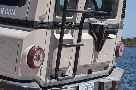
Most notably, a large lambda is stamped into the small REAR DOOR, but there is another one on the LEFT EDGE of the hood/bonnet. Here, however, the lambda sits within the recessed word “Grenadier.” Lastly, if equipped, the word Grenadier is embossed into the hard-plastic SPARE-TIRE COVER.
So where to from here? I am writing a separate article that focuses on specific automotive badges of the past and potentially going back to the future. To be continued…
I stated in a previous post that I like “old things” in both function and form. Many contemporary items might work better, but many don’t look nearly as good. Even though some may argue capability, there’s no debate that the OLD DEFENDER looks waaaay better than the NEW ONE! I would offer that same opinion about the Mustang (1965 and 2023) and nearly every vehicle I spoke about HERE!
When it comes to design I’m also a huge logo nerd. There are some fantastic current logos but I truly love the classics. These timeless logos have not only stood the test of time, they still manage to pull it off well today. Just think of the FERRARI LOGO – which despite evolving some over the years to remain contemporary would look completely familiar in 1950s Maranello. There are many classic car/car company logos that have managed this fete - the CHEVY BOWTIE, MERCEDES TRI-STAR, MASERATI TRIDENT, and the wings of ASTON MARTIN and BENTLEY.
There are type-face logos that have stood the test of time too – Ford’s scripted BLUE OVAL, the slanted ALPINE A, the special interlocking Rs of ROLLS-ROYCE and a certain circular combination of a V AND W. Good design really is timeless.
When it comes to the automotive world, there are also wonderful secondary logos. I’m referring to things like those beautiful, old-school interlocking Vs and 8s. Accompanying acronymic letters denoting something special – STI, GTI, and GTO. And even little hieroglyphs – a Super Bee, a Super Bird, and a Super Snake.
So how does any of this relate to the INEOS Grenadier or the Global Grenadiers? The latter applies because we’ve managed to come up with a nice-looking CLUB LOGO and an accompanying personalized member-number-displaying BADGE. The former because INEOS badging is standard exterior and interior fare on each and every Grenadier.
INEOS has two major logos – a bespoke CAPITAL O and then a word-based one the incorporates the “O” with other letters. The INEOS WORD-LOGO begins with the capital letters I and N in a very thin, light seriffed font and then sandwiches the unique O between the capital letters E and S. The E and S are noticeably different than the I and N in look, as they are from a heavy sanserif typeface. INEOS uses both of these logos for all of its respective ventures, including their chemical businesses, F1 and football endeavors, and INEOS Automotive itself.
Moving off the printed page and into the third dimension, the full-word INEOS logo is found on the Grenadier’s RIGHT-SIDE REAR DOOR in the lower corner. The badge is a black rectangle with the INEOS word-logo written in chrome. The INEOS “O” can be found not only in the rear text badge, as described above, but also on the vehicle’s HOOD/BONNET, where the chromed circular logo sits in a small recess.
INEOS Automotive holds another distinct logo in the INEOS portfolio. The SYMBOL is utilized as an uppercase A, but in reality, it’s a stylized symbol that looks like an upside-down V. This character is in fact a letter from the Greek alphabet – a capital lambda. The INEOS version is sanserif in nature, features a flat apex, and uses gently-rounded exterior corners. Additionally, despite be used to represent a capital A, there is no crossbar; this logo can be found both inside and outside of the Grenadier.
Most notably, a large lambda is stamped into the small REAR DOOR, but there is another one on the LEFT EDGE of the hood/bonnet. Here, however, the lambda sits within the recessed word “Grenadier.” Lastly, if equipped, the word Grenadier is embossed into the hard-plastic SPARE-TIRE COVER.
So where to from here? I am writing a separate article that focuses on specific automotive badges of the past and potentially going back to the future. To be continued…
Last edited:
")